
MP Health
Healthcare scheduling platform UI/UX
Project under BU Spark! Labs
Boston University Fall 2020
![]()
Teammates Applying fellows Christian Soderberg (applicant), Kaela Gobencion Technical Teammates Kevin Tu, Asif Rahman
Mentors Red Hat Agency- Katie Riker, BU Spark!
Boston University Fall 2020
Teammates Applying fellows Christian Soderberg (applicant), Kaela Gobencion Technical Teammates Kevin Tu, Asif Rahman
Mentors Red Hat Agency- Katie Riker, BU Spark!
Problem Statement
Modern day small scale clinics deal with a lot of time and resource waste because of lack of efficient time management.
There is a reason why big health insurance companies such as Medicare allow for people to get free annual wellness visit. Being able to prevent any harmful disease or condition from spreading allows for the patient to become safer and cheaper. After speaking with many doctors, one of the most occurring problems in this tech evolved world, is that people have to wait on holds or call at specific hours to schedule an appointment eons from now.
Solution Statement
An efficient time managing tool can make the clinics self sufficient and optimise their productivity. Increasing productivity could also lead to cheaper healthcare system in future.
Project brief
MP Health is a scheduling platform that helps Medical Clinics jump towards the next step in the future. By automating one the main jobs of a modern day receptionist, MP Health will give the opportunity for any clinic to become technologically advanced and efficient.

- We started off by making the website with a complex dashboard and lots of features in the start, we were asked to narrow down on what we want to focus on.
- The initial idea was to build a telehealth app but because of possible issues with hipaa compliance we chose to work with only scheduling.
- The logo started off as a tick combined with a heart, the M representing the pulse.
- The colour choices were bold with an autumn feel to it.

- Resolved the issue with the logo where it has both M and P of “MP Health”.
- Made wireframes specific to scheduling
- We were told to avoid using red as a primary color as red is applied more as an alert color.
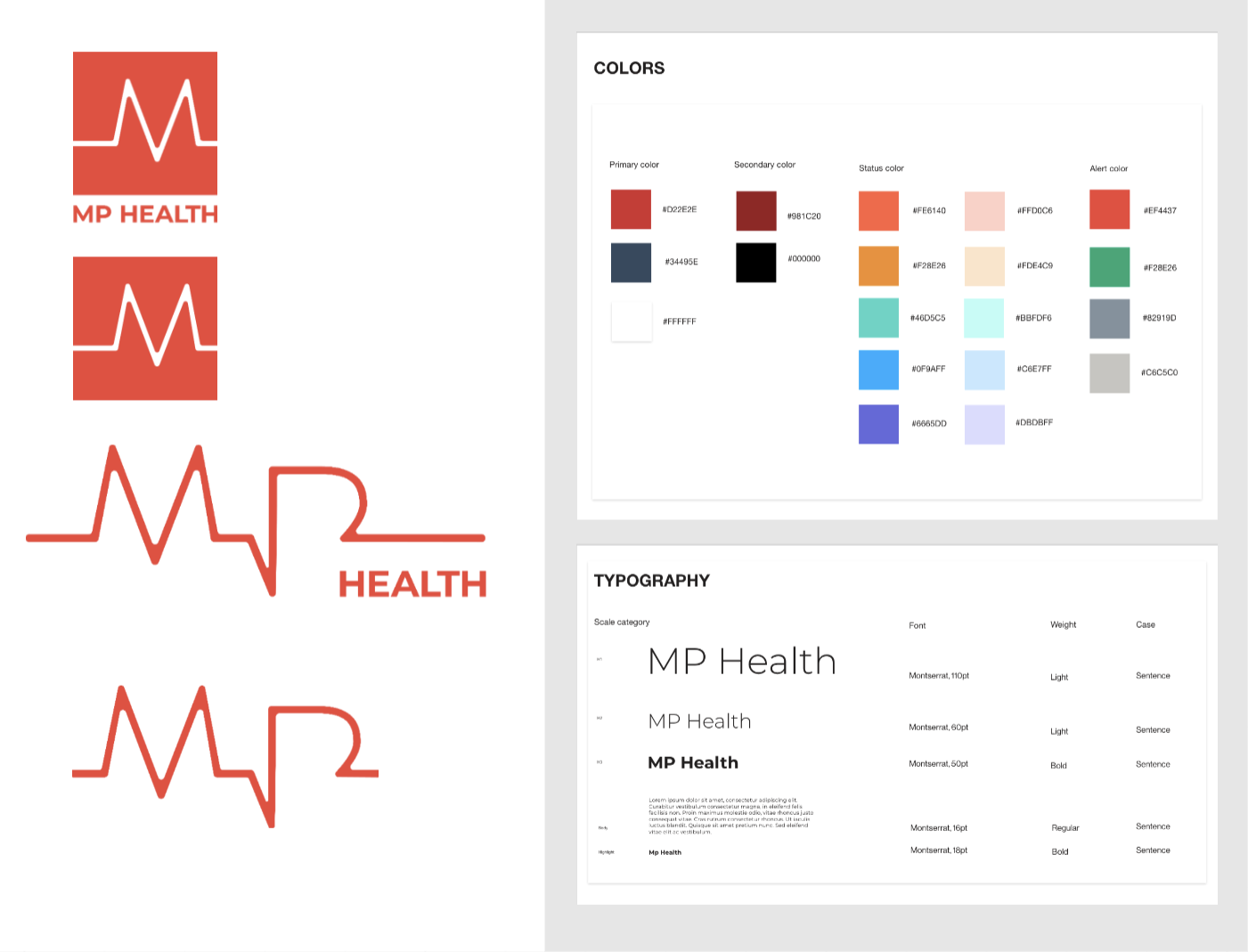
- Added more muted colors to the palette to make the website more pleasing to the eye and minimal looking.

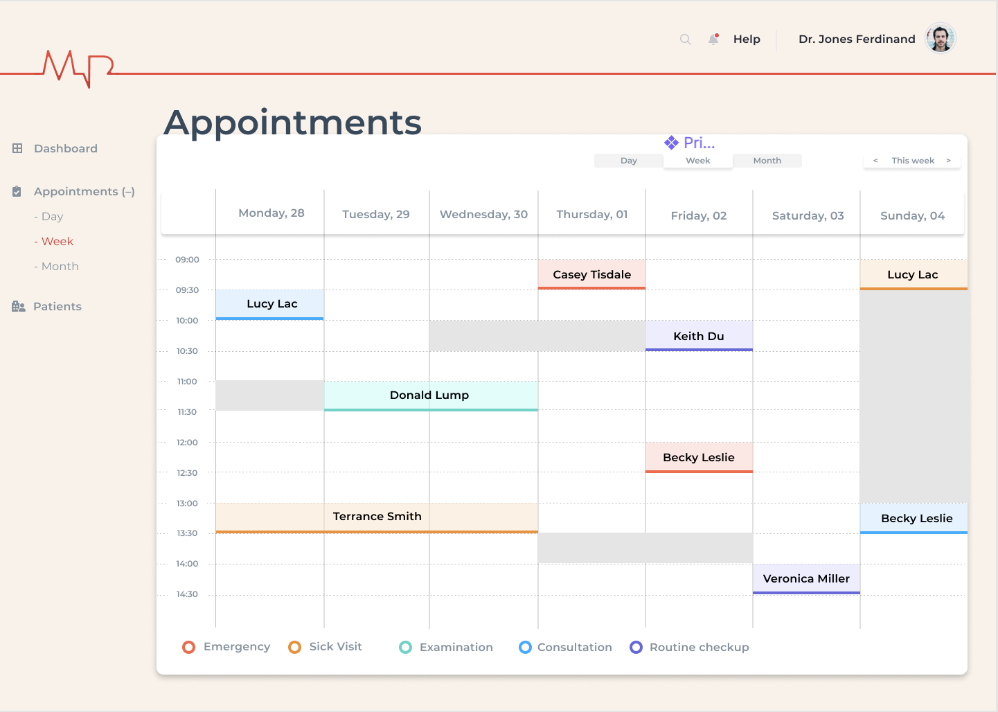
- Added rescheduling flow to the wireframes. Added color coding to distinguish the different types of appointments.


Teammates’ feedback
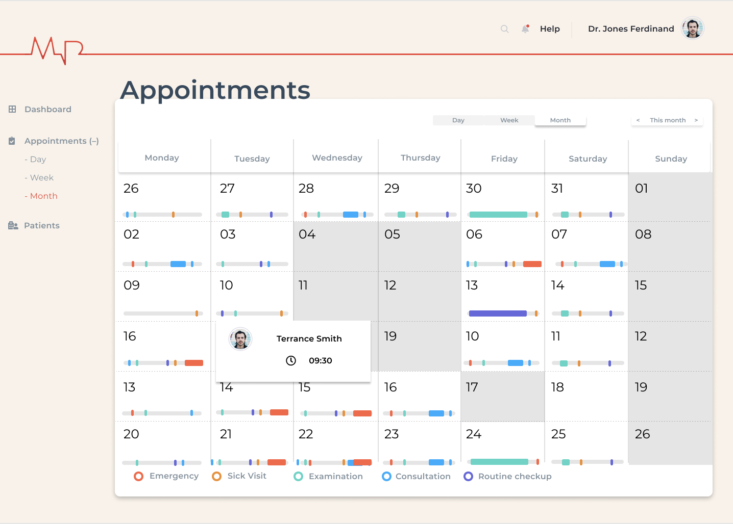
- The developers were finding it hard to understand how to code the month view so I worked on simplifying it
- Adding a first time patient view with appointment duration of an hour.
- Removing patient login all together.
Mentors’ Feedback:
- Moving the legends on left or top to ensure visibility
- Add search panel in doctor's view to search patients instead of a drop down list (having too many patients could create confusion)
- Color is an unreliabale indicator, more details about the appointment should be added in text.
- Avoid centred text
- Color blindness tool for UX
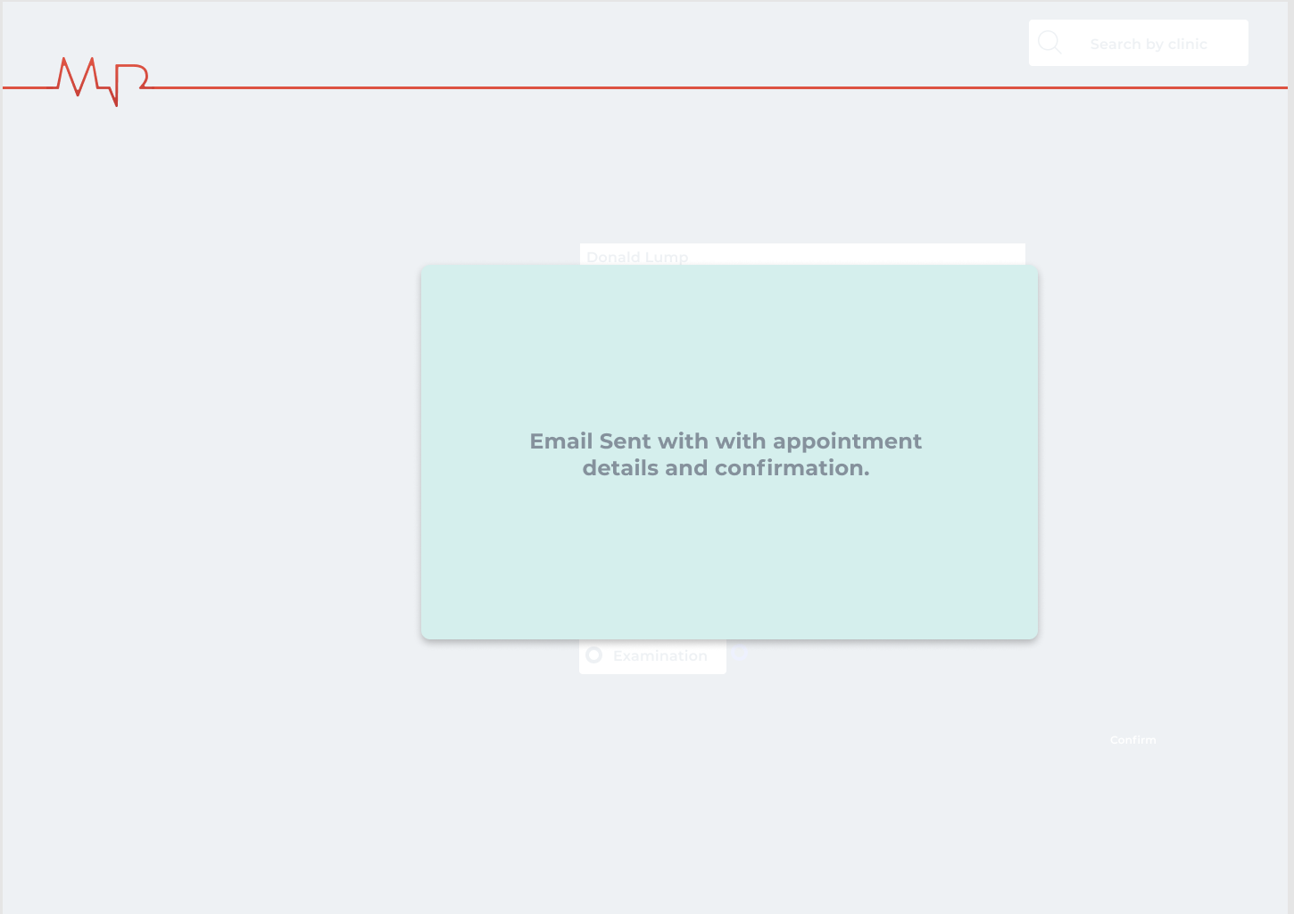
- Add a patient appointment confirmation form in the patient view
- Send confirmation mail
- Considering putting two of the views together.
- Finding out if the developers are comfortable with the design.
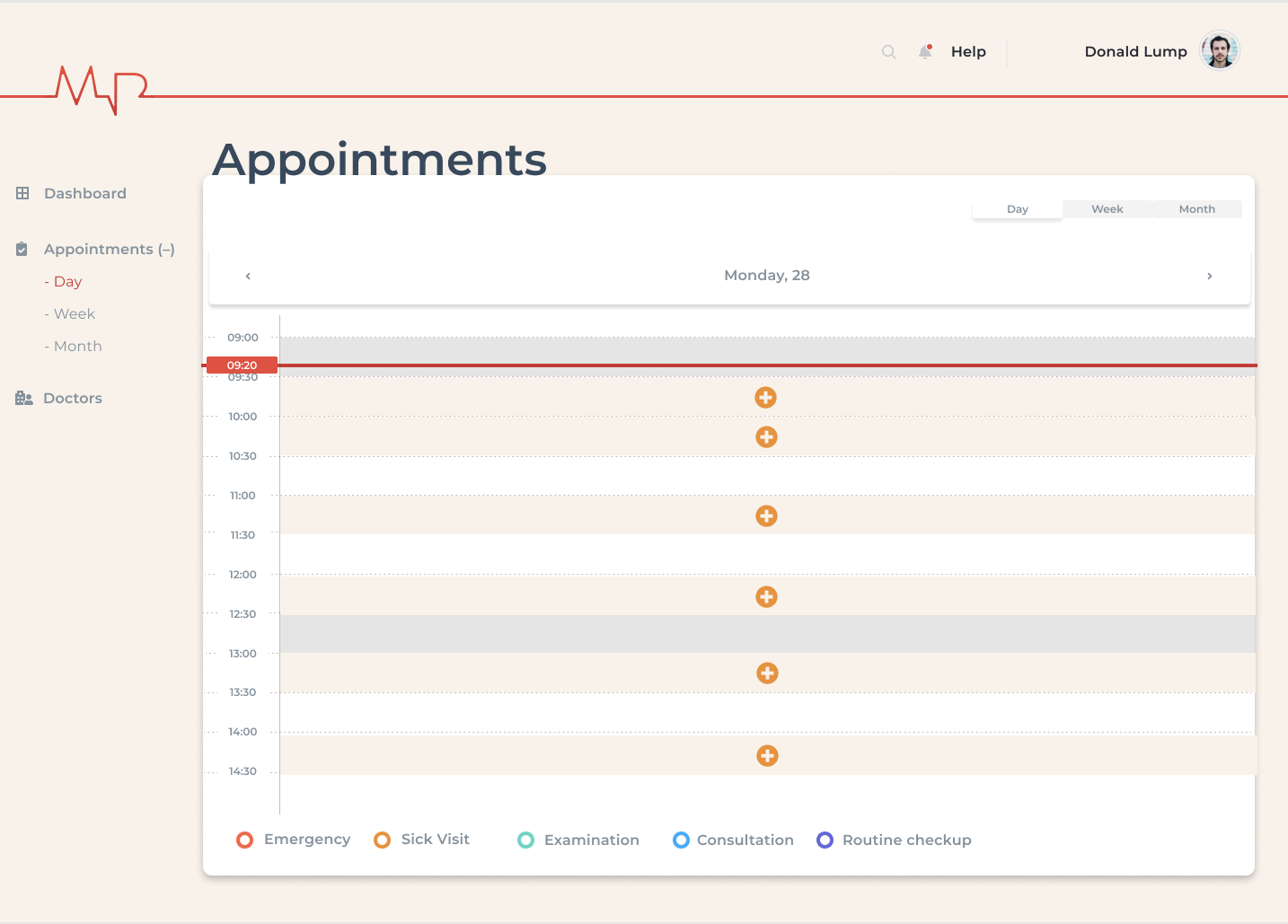
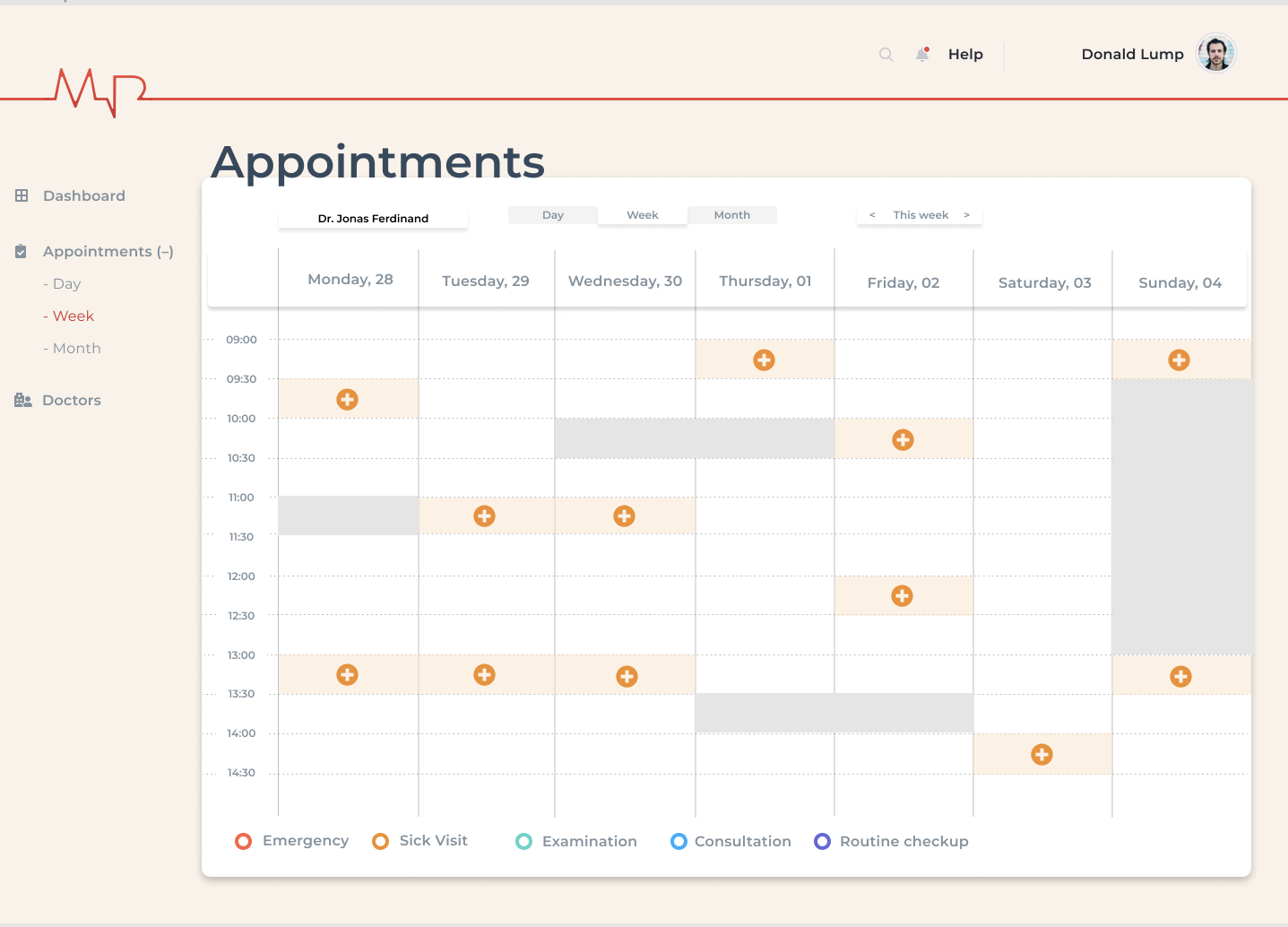
Final Wireframes (Doctor’s view)
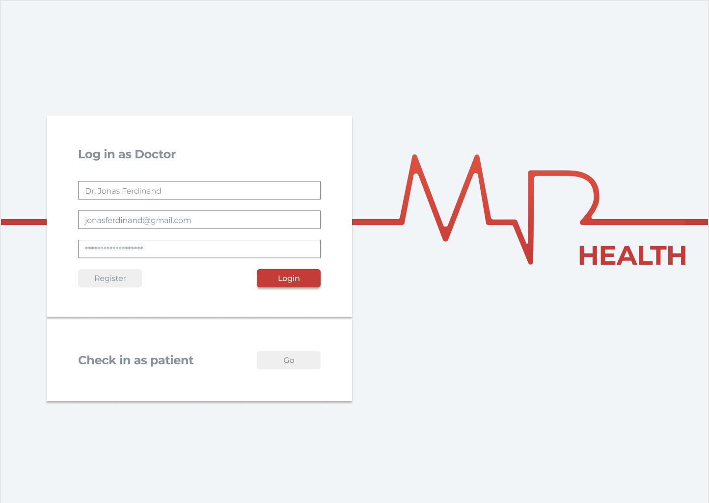
Doctor login
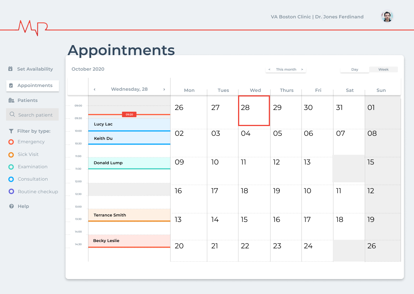
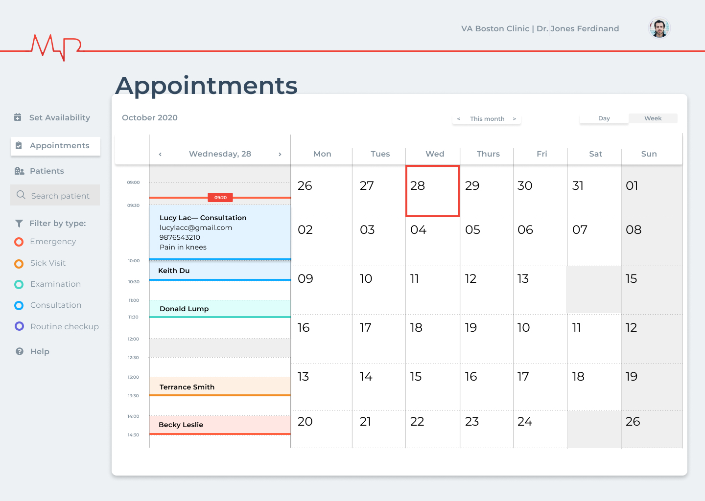
Day(month) view with appointment details
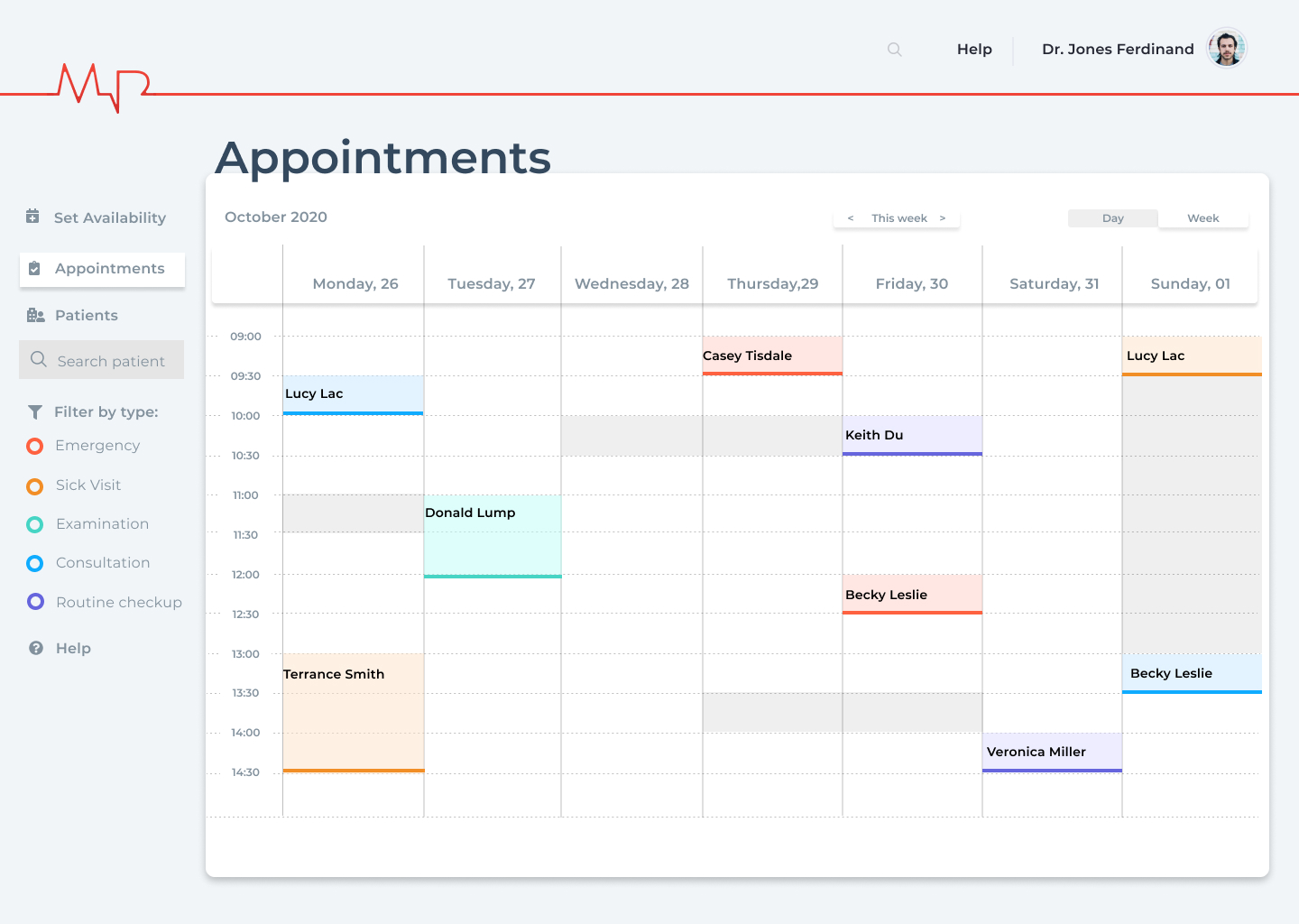
Week view with appointment details
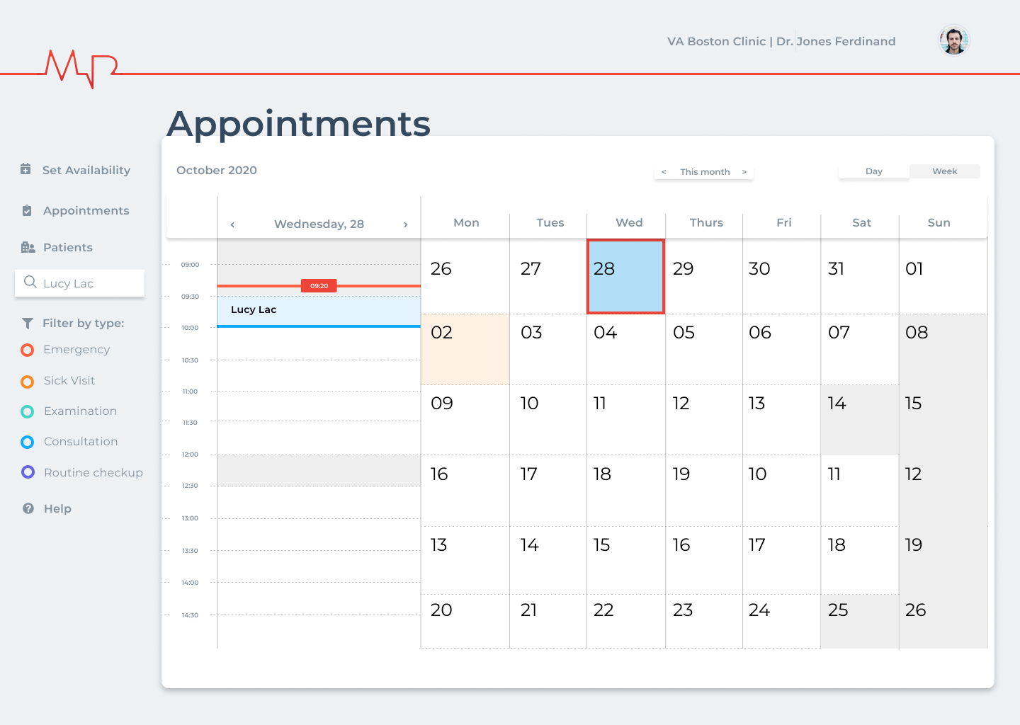
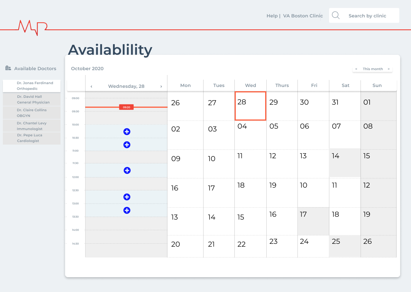
Patient specific day (month view)
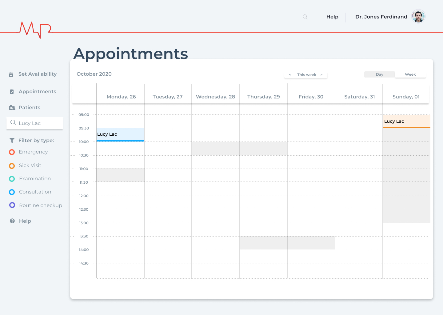
Patient specific week view
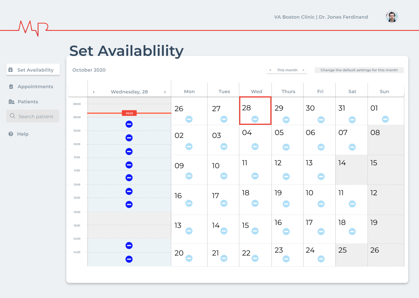
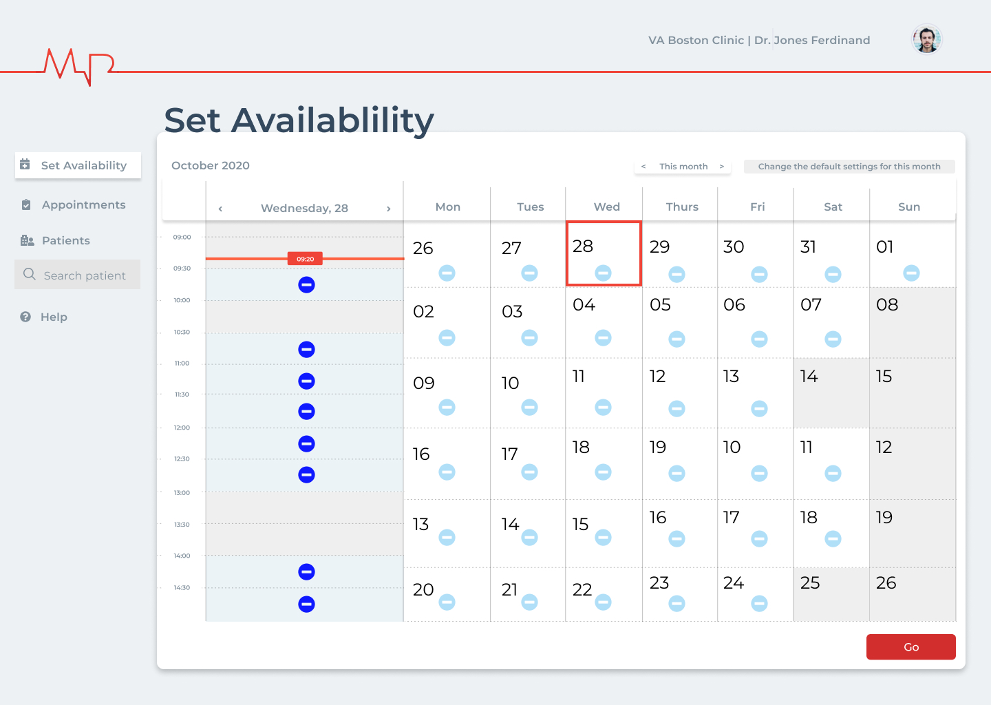
Setting availability.
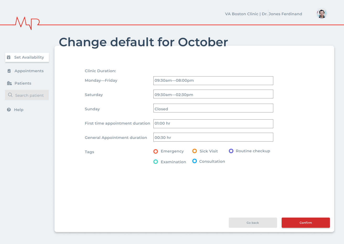
Changing default scheduling settings
Final Wireframes (Patient’s view)

Patient checkin

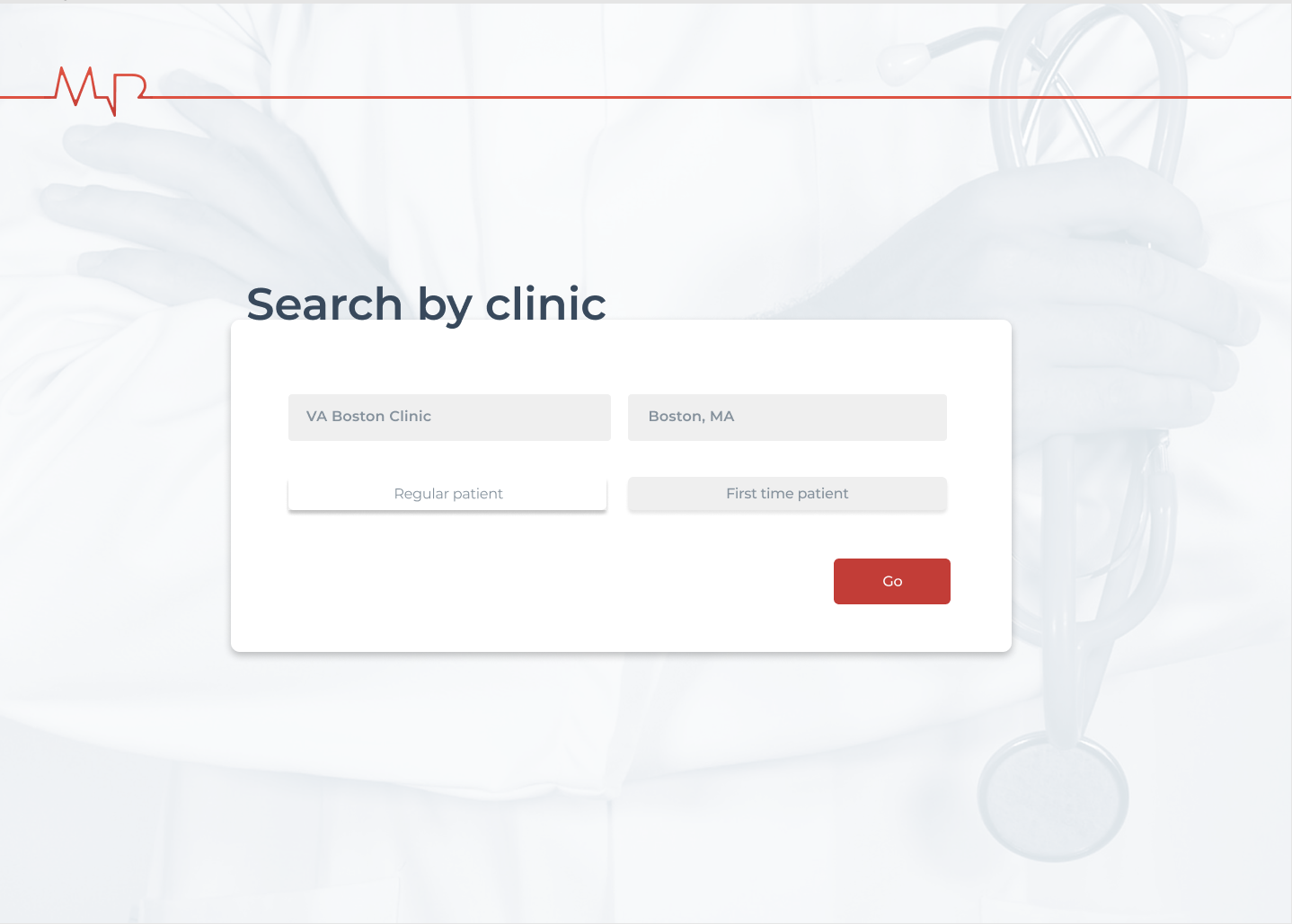
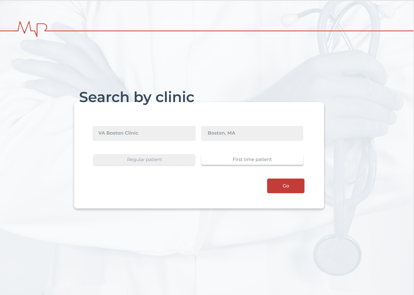
Search clinic page

Appointment booking for regular patients

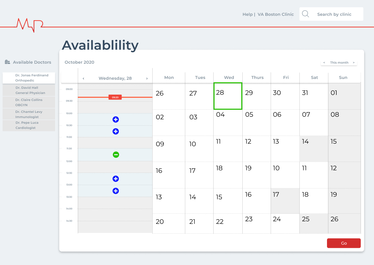
Appointment booking for first time patient
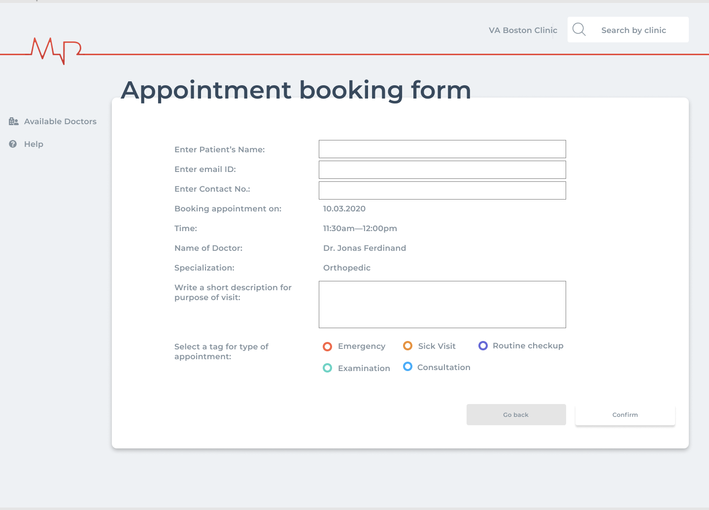
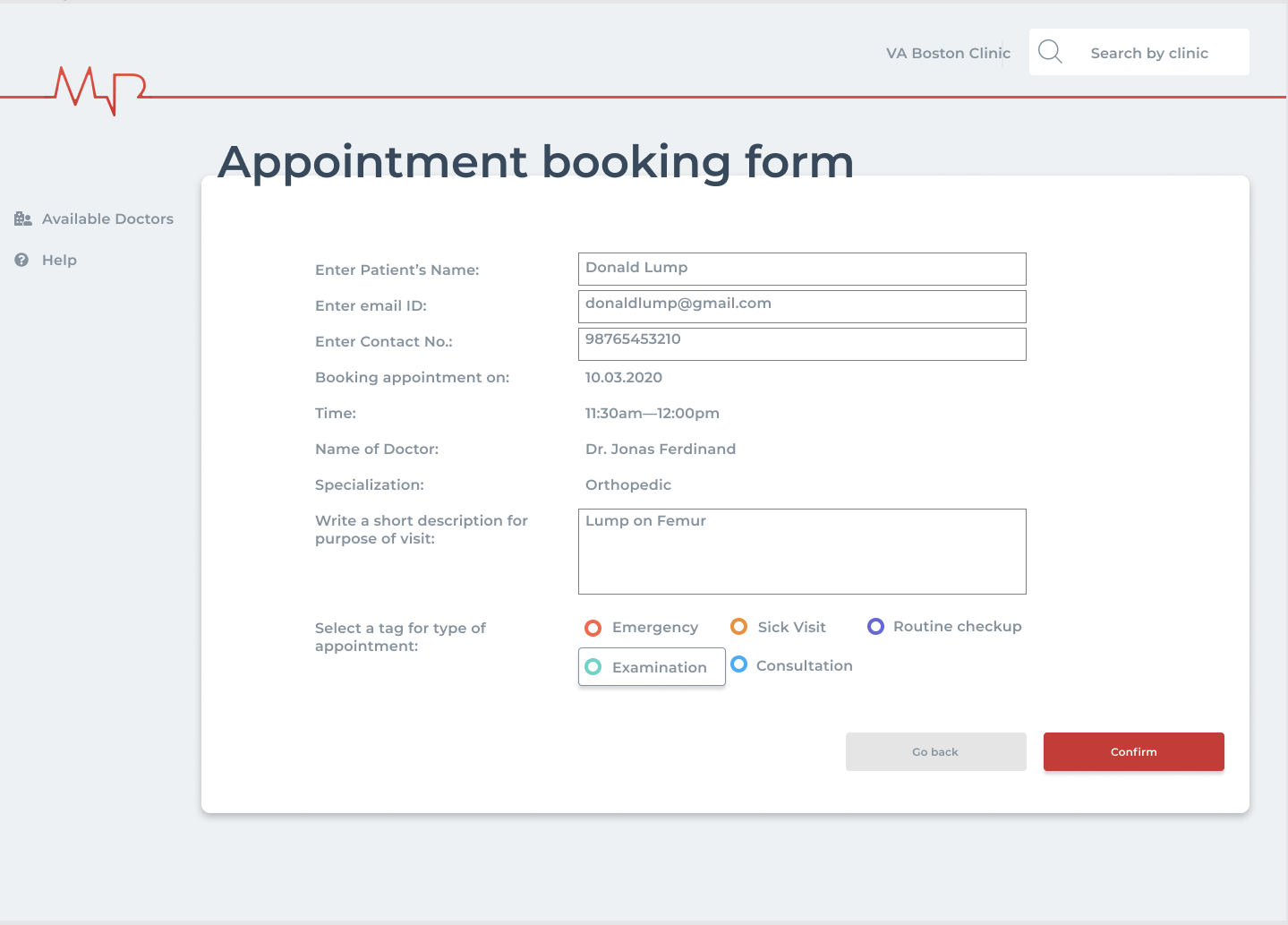
Appointment booking form and confirmation